Charting the Economy

Timely economic data curated by research staff at the Federal Reserve Bank of Kansas City. Click the link button in the chart title to copy and share.


Filters
Agriculture AI Banking and Finance Covid-19 Research Data and Trends Economic Geography Energy Housing Inflation International Jackson Hole Economic Policy Symposium Labor and Demographics Macroeconomics Manufacturing Monetary Policy Natural Resources and Environment Payments Regional Clear Filters
CtE26-MatschkedeVyver

The Rising Popularity of Stablecoins Could Reinforce the Global Role of the U.S. Dollar
Charting the Economy | Banking and Finance | International
CtE26-HirnerMustre-del-Rio

Credit Card Delinquencies Are Becoming More Widespread Across the U.S. Population
Charting the Economy | Banking and Finance | Macroeconomics | Monetary Policy | Payments
CtE26-FelixKiceRappaport2

Manufacturers Resisted Laying off Workers as Backlogs Fell; Now They May Be Slow to Increase Employment as Backlogs Rise
Charting the Economy | Labor and Demographics | Manufacturing | Regional
CtE26-GloverOliyide

According to the Taylor Rule, the Federal Funds Rate Should Probably Be Higher—By How Much Is Uncertain

Charting the Economy | Inflation | Macroeconomics | Monetary Policy
CtE26-FelixKiceRappaport

Over Half of Surveyed Firms Report Decreased Profit Margins This Year, as Most Absorbed a Portion of Higher Input Costs

Charting the Economy | Inflation | Manufacturing | Regional
CtE26-BiVasiljevicYang

Employment in AI-Intensive Sectors Is Growing More Slowly

Charting the Economy | AI | Labor and Demographics | Macroeconomics
CtECowleyFarhaMarch2026

Natural Amenities Account for Nearly One-Third of Housing Affordability Differences Across Counties

Charting the Economy | Economic Geography | Housing | Regional
CtEBrownMarch2026

Higher Initial Well Output in the Permian Basin Has Not Slowed Oil Production Declines

Charting the Economy | Energy | Natural Resources and Environment
Investors See Greater Downside Risk Around the Path of Interest Rates

Investors See Greater Downside Risk Around the Path of Interest Rates

Charting the Economy | Data and Trends | Macroeconomics | Monetary Policy
Load More

The Rising Popularity of Stablecoins Could Reinforce the Global Role of the U.S. Dollar

By Johannes Matschke and David deVyver

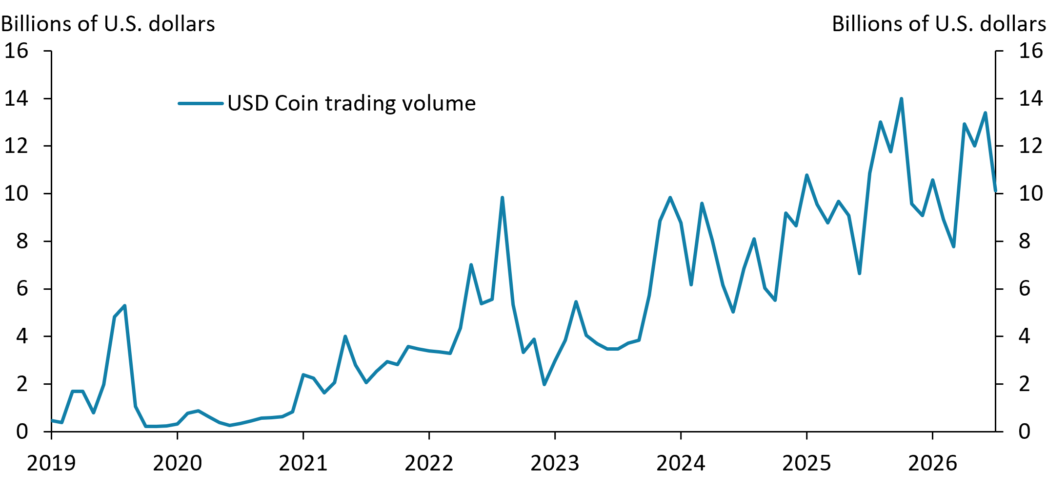
The trading volume of stablecoin USD Coin rose substantially from 2023 to 2026, a sign of stablecoins’ increasing popularity.

Note: Chart depicts the average daily trading volume of stablecoin USD Coin at monthly frequency in billions of U.S. dollars.

Source: CoinGecko (Haver Analytics).

Stablecoins have grown increasingly popular in recent years, as indicated by the growing trading volume of stablecoin USD Coin. One reason for the growth in stablecoin trading is that stablecoins can reduce payment frictions, particularly for cross-border transactions. In a paper presented at the Kansas City Fed’s 2026 Jackson Hole Economic Policy Symposium, Eswar Prasad, Gordon Liao, and Tony Zhang argue that because most stablecoins are backed by U.S. dollar-denominated assets, the increasing use of stablecoins for borrowing and lending may reinforce the dollar’s global dominance. However, they also highlight that stablecoins introduce risks if not fully backed by safe and liquid assets, which provide a credible backstop during financial market distress.

Related Content

Jackson Hole Economic Policy Symposium

The Federal Reserve Bank of Kansas City hosts dozens of central bankers, policymakers, academics and economists from around...

Charting the Economy Banking and Finance International

Credit Card Delinquencies Are Becoming More Widespread Across the U.S. Population

By Molly E. Hirner and José Mustre-del-Río

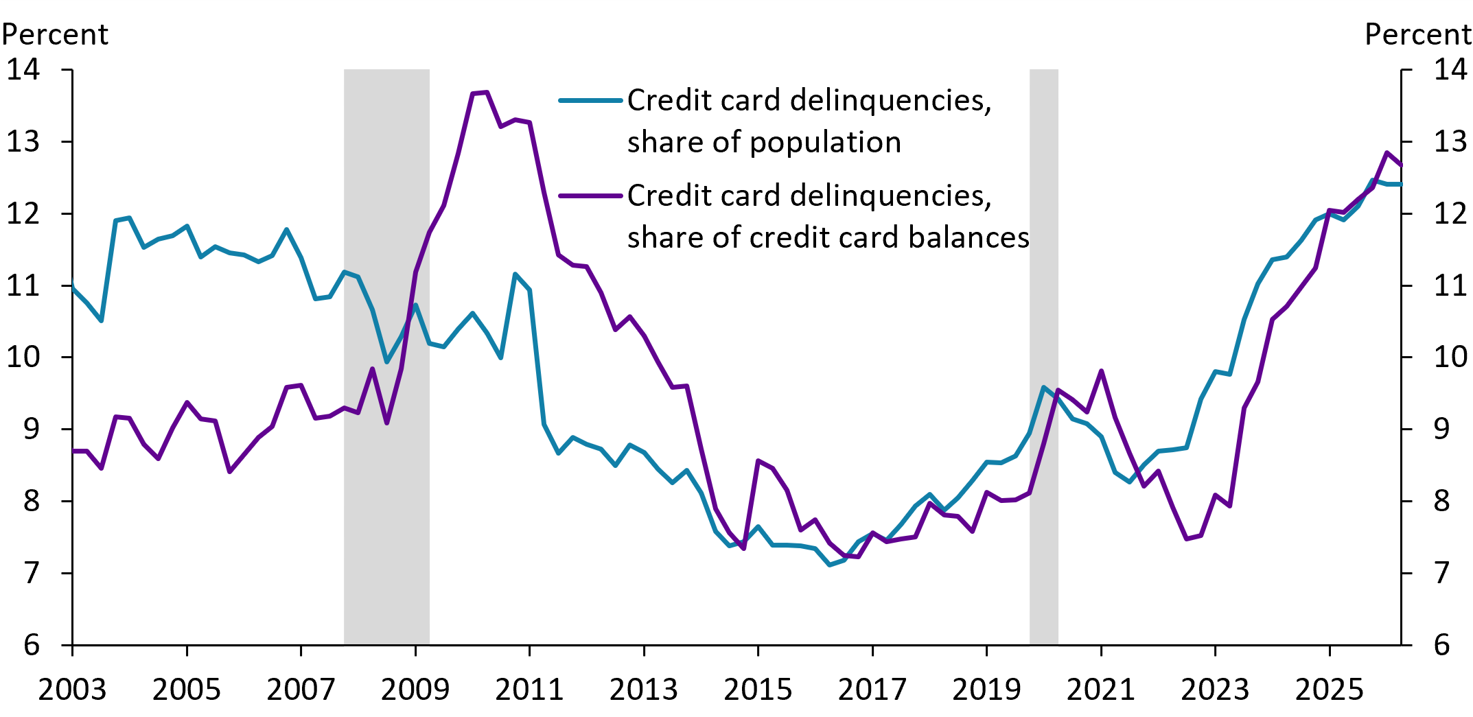
Since 2023, both the share of the population with at least one severely delinquent (90+ days past due) credit card and the share of credit card balances that are severely delinquent have moved up. In contrast, during the Great Recession in 2007–09, the population measure was fairly constant, if not falling, while the balance measure rose sharply.

Notes: Delinquent debt is debt 90 days or more past due. The total population is defined as those with at least one credit card account. Data as of 2026:Q2. Gray bars denote National Bureau of Economic Research (NBER)-defined recessions.

Sources: Federal Reserve Bank of New York Consumer Credit Panel/Equifax Data, NBER (Haver Analytics), and authors’ calculations.

Since 2023, both the share of the U.S. population with at least one severely delinquent (90+ days past due) credit card (blue line) and the share of credit card balances that are severely delinquent (purple line) have moved up. In contrast, during the Great Recession in 2007–09, the population measure was fairly constant, if not falling, while the balance measure rose sharply. Although the balance measure is currently below its peak in 2010, severe delinquencies are now more widespread across the U.S. population than at any point in the past two decades.

Charting the Economy Banking and Finance Macroeconomics Monetary Policy Payments

Manufacturers Resisted Laying off Workers as Backlogs Fell; Now They May Be Slow to Increase Employment as Backlogs Rise

By Alison Felix, Max Kice and Jordan Rappaport

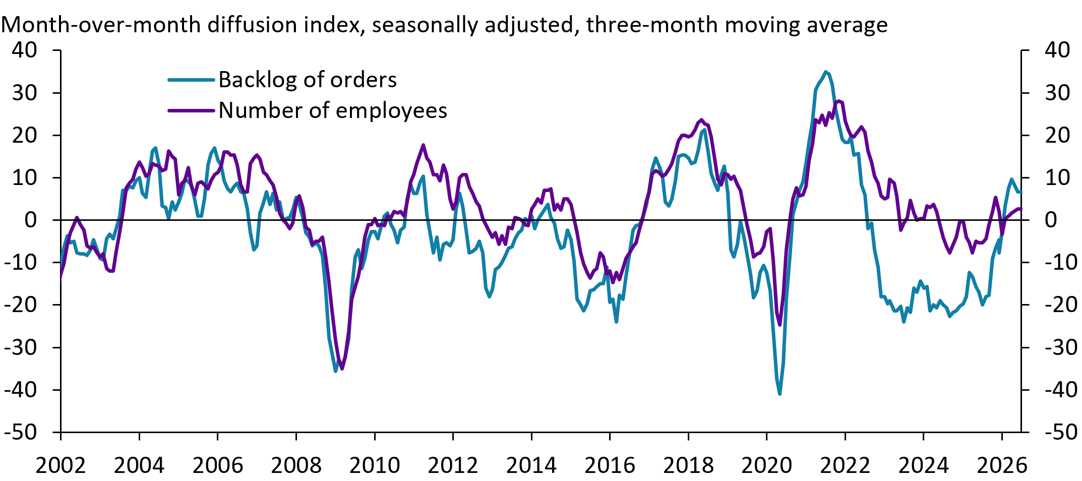
Since 2002, responses to the Kansas City Fed’s Manufacturing Survey show a close correlation between movements in their backlog of orders and their employment levels. However, from late 2022 to 2025, this relationship changed as many manufacturers reported flat employment levels even as their backlog of orders declined sharply. Although survey contacts have reported that their backlog of orders has increased in recent months, manufacturers may now be slower to increase employment.

Note: The diffusion indexes show the net percentage of firms reporting an increase in the backlog of orders and the net percentage reporting an increase in the number of employees.

Source: Federal Reserve Bank of Kansas City.

Manufacturers typically adjust their employment (purple line in the chart) in line with changes in their backlog of orders (blue line), as responses to the Kansas City Fed’s Manufacturing Survey highlight. From late 2022 to 2025, however, many manufacturers resisted laying off workers even as their backlog of orders fell sharply. One reason for such “labor hoarding” was the difficulty businesses had in attracting and retaining workers as the economy emerged from the pandemic. Consequently, manufacturers may now be slower to increase employment even as their backlog of orders increases, as contacts report it has in recent months.

Charting the Economy Labor and Demographics Manufacturing Regional

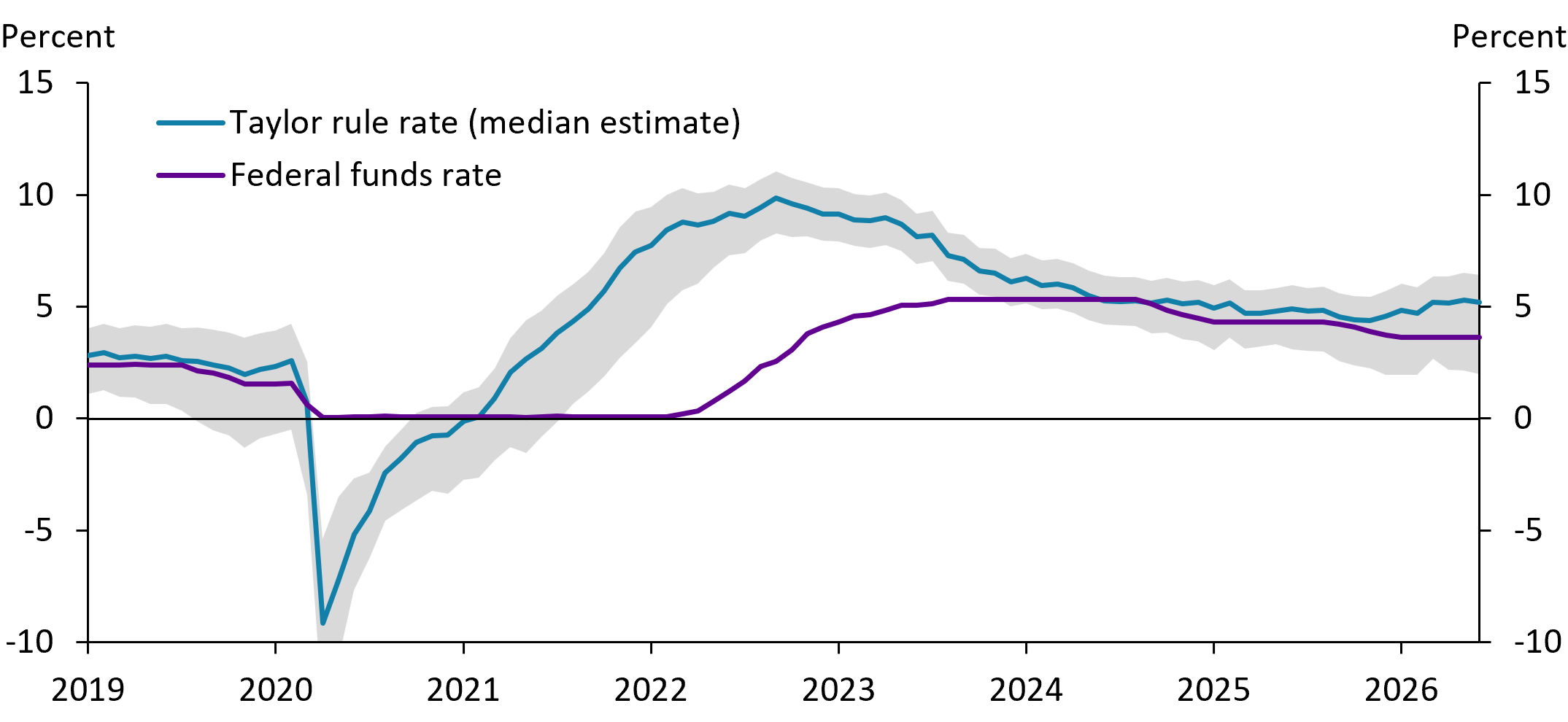
According to the Taylor Rule, the Federal Funds Rate Should Probably Be Higher—By How Much Is Uncertain

By Andrew Glover and Johnson Oliyide

Using the KC Fed Model-Based measures of r-star and u-star, the median federal funds rate consistent with the Taylor rule should be 1.6 percentage points above the August 2026 federal funds rate. Uncertainty about r-star and u-star creates a wide range of federal funds rates consistent with the Taylor rule, but most of our estimates call for at least some increase in the current federal funds rate.

Notes: The Taylor rule rate is calculated as the nominal natural rate (based on the KC Fed Model-Based Natural Rate of Interest) plus a weighted sum of the inflation gap (core PCE minus 2 percent) and the unemployment gap (unemployment rate minus the KC Fed Model-Based Natural Unemployment Rate). Weights are from Taylor (1993) with an Okun’s Law coefficient of 2. The blue line shows the median Taylor rule rate produced by the model, and the shaded region covers the middle 68 percent of the Taylor rule rate estimates.

Sources: Federal Reserve Bank of Kansas City, U.S. Bureau of Economic Analysis (Haver Analytics), U.S. Bureau of Labor Statistics (Haver Analytics), and authors’ calculations.

Download the data file for this chart.

The Taylor rule calls for the federal funds rate to increase if inflation is above 2 percent or unemployment is below the natural unemployment rate (u*), but to otherwise track the natural rate of interest (r*). Following the Taylor rule, our median estimates of u* and r* indicate a 1.6 percentage point increase in the federal funds rate relative to its August 2026 level (difference between purple and blue lines). Although uncertainty about u* and r* creates a wide range of federal funds rates consistent with the Taylor rule (gray shaded region), 73 percent of our current Taylor rule estimates call for a higher federal funds rate.

Related Content

Kansas City Fed Model-Based Natural Rate of Interest and Natural Unemployment Rate

The Kansas City Fed Model-Based Natural Rate of Interest (r*) and Natural Unemployment Rate (u*) are monthly estimates of the...

Charting the Economy Inflation Macroeconomics Monetary Policy

Over Half of Surveyed Firms Report Decreased Profit Margins This Year, as Most Absorbed a Portion of Higher Input Costs

By Alison Felix, Max Kice and Jordan Rappaport

Over half of respondents to the Kansas City Fed’s Manufacturing and Services Surveys recently reported passing on no more than 20 percent of their higher input costs to customers, with only one in five firms passing on more than 80 percent. Over half of survey respondents also indicated that their profit margins have declined since the start of 2026.

Notes: Panel A shows survey responses to the June 2026 question, “If your firm is facing higher costs (inputs and labor), what share of those increases are you able to pass through to customers in the form of higher prices?” Panel B shows survey responses to the July 2026 question, “Given current price pressures, how have profit margins changed for your firm since the beginning of the year?”

Source: Federal Reserve Bank of Kansas City.

Most firms facing higher prices for inputs and labor are currently absorbing a large portion of these higher costs rather than passing them on to customers. Over half of respondents to the Kansas City Fed’s Manufacturing and Services Surveys recently reported passing on no more than 20 percent of their higher costs, with only one in five firms passing on more than 80 percent. Many firms have at least partly offset higher input costs by cutting other expenses or exploring efficiency gains. Even so, over half of firms report that their profit margins have declined since the start of the year.

Charting the Economy Inflation Manufacturing Regional

Employment in AI-Intensive Sectors Is Growing More Slowly

By Huixin Bi, Stephen D. Vasiljevic and Shu-Kuei X. Yang

Since November 2022, sectors with a larger share of job postings requiring AI skills have generally seen slower job growth relative to their pre-COVID trend. The information sector is the notable outlier in the chart due to its high share of AI-related jobs and its relatively small size, but job losses have also been significant in this sector since November 2022.

Notes: Each dot represents one industry at the two-digit North American Industry Classification System (NAICS) level. The horizontal axis shows the average monthly share of job postings requiring AI skills between January and May 2026. The vertical axis shows the change in average monthly job growth between November 2022 and May 2026, measured against the pre-COVID trend (January 2010–December 2019), in thousands. The fitted line shows the correlation between the two measures across industries, excluding NAICS sector 51 (Information), shown in purple.

Sources: U.S. Bureau of Labor Statistics and Lightcast.

Download the data file for this chart.

Since November 2022, sectors with a larger share of job postings requiring AI skills (horizontal axis) have generally seen slower job growth relative to their pre-COVID trend (vertical axis). This pattern offers tentative evidence that AI may be displacing workers in some sectors while augmenting them in others. The correlation is only suggestive, however, as other factors including post-pandemic demand shifts and sector-specific cycles could also be driving the differences in job growth. The information sector (purple dot) is the notable outlier in the chart due to its high share of AI-related jobs and its relatively small size, but job losses have also been significant in this sector since November 2022.

Charting the Economy AI Labor and Demographics Macroeconomics

Natural Amenities Account for Nearly One-Third of Housing Affordability Differences Across Counties

By Cortney Cowley and Chase Farha

U.S. counties with higher natural amenities scores typically had higher median home values relative to household income in 2024. Overall, natural amenities accounted for 31 percent of variation in home affordability across U.S. counties. The Tenth Federal Reserve District had some counties with particularly high home value-to-income ratios, all located in scenic areas of Colorado and Wyoming.

Notes: The vertical axis is on a logarithmic scale and shows the average monthly median home value for a county divided by the county median household income in 2024. The horizontal axis shows the natural logarithm of the USDA’s natural amenities score, after adding 8.25 to avoid negative values. The chart plots 3,045 U.S. counties, 412 of which are in the Tenth Federal Reserve District. The plotted curve excludes the bottom 1 percent of natural amenities scores for clarity, but the regression was estimated using all counties.

Sources: U.S. Department of Agriculture (USDA), Zillow, U.S. Census Bureau, and authors’ calculations.

Download the data file for this chart.

In the United States, homes in counties with greater natural amenities were less affordable, on average, in 2024. The light blue dots and fitted curve in the chart show that counties with higher natural amenities scores typically had higher median home values relative to household income. Overall, natural amenities accounted for 31 percent of variation in home affordability across U.S. counties. The Tenth Federal Reserve District (dark blue dots) had some counties with particularly high home value-to-income ratios, all located in scenic areas of Colorado and Wyoming.

Related Content

First-Time Homeownership Became Less Affordable Across Most of the United States in Recent Years

Chase Farha, John McCoy and David Rodziewicz

New homeownership became less affordable across much of the United States over the last five years. Swiftly rising house...

Charting the Economy Economic Geography Housing Regional

Higher Initial Well Output in the Permian Basin Has Not Slowed Oil Production Declines

By Jason P. Brown

The chart shows rising peak average oil well production in the Permian Basin through 2024, with initial output often reaching 700–800 barrels per day. However, production declines sharply in the first year—by around 50–70 percent—suggesting technology has lifted peaks more than flattened decline rates.

Note: The chart shows average monthly well production from first production date for all producing wells in the Delaware sub-basin of the Permian from January 2018 through December 2025.

Source: Enverus.

The Permian Basin in western Texas and southeastern New Mexico has been a major driver of U.S. crude oil, helping lift total U.S. production to near record highs of about 13.6 million barrels per day on average throughout 2025. Whether this output can be sustained will depend on drilling intensity, inventory quality, and oil prices. The chart shows rising peak average well production through 2024, with initial output often reaching 700–800 barrels per day. However, production declines sharply in the first year—by around 50–70 percent—suggesting technology has lifted peaks more than flattened decline rates. Recent production data hint at plateauing gains, as peak output resembles prior highs and production tails converge.

Charting the Economy Energy Natural Resources and Environment

Investors See Greater Downside Risk Around the Path of Interest Rates

By Hassan Aamir, Brent Bundick, Mariia Dzholos and A. Lee Smith

The Kansas City Fed’s Measure of Policy Rate Skew (KC PRS) is a daily measure of how financial markets perceive the balance of risks to short-term U.S. interest rates one year in the future. Prior analysis shows the KC PRS can indicate whether future short-term interest rates are likely to be higher or lower than forecasters predicted in real time. Over the past year, the KC PRS has reached historically low levels, indicating that investors see greater downside risk around the path of interest rates. See the Economic Bulletin, "How Do Financial Markets Perceive the Balance of Risks to the Policy Rate?" by Bundick, Doh, and Smith (2024) for more information and analysis.

Related Content

How Do Financial Markets Perceive the Balance of Risks to the Policy Rate?

Brent Bundick, Taeyoung Doh and A. Lee Smith

We introduce a new measure of policy rate skew that uses interest rate options prices to summarize market-perceived risks to...

Charting the Economy Data and Trends Macroeconomics Monetary Policy