The COVID-19 pandemic has touched every corner of the United States, but some regions have been hit harder than others. Financially distressed areas of the country in particular may face tougher challenges, as people who are more financially vulnerable are less able to weather adverse events (see, for example, Athreya and others 2020). Indeed, financial distress can be thought of as an “economic pre-existing condition” because it is concentrated among a small proportion of individuals in persistent trouble and is long-lasting (Athreya, Mustre-del-Río, and Sánchez 2019).
To assess whether the pandemic has spread more in financially distressed areas, Chart 1 plots the shares of COVID-19 cases in counties in each quintile of financial distress, measured by the percentage of individuals in each county who were at least 30 days delinquent on bank card debt in 2018 (that is, pre-pandemic)._ The lowest quintile of financial distress, Q1, contains counties with the smallest fraction of financially distressed individuals, while the highest quintile of financial distress, Q5, contains counties with the highest fraction of financially distressed individuals.
Chart 1: Until Recently, Quintiles with Greater Financial Distress Have Accounted for a Larger Share of All COVID-19 Cases in the United States
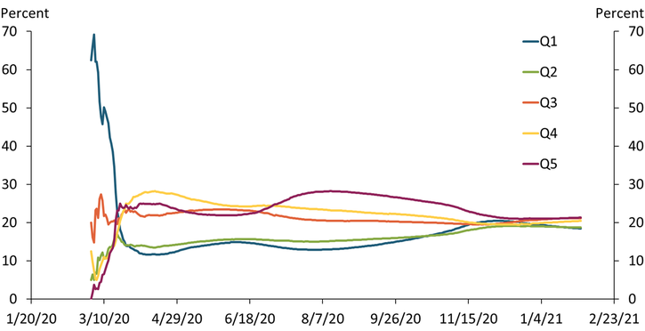
Sources: USAfacts.org, U.S. Census Bureau, Federal Reserve Bank of New York Consumer Credit Panel/Equifax Data, and authors’ calculations.
The chart shows that except for the first few weeks of the pandemic, counties with higher financial distress have accounted for a larger share of total COVID-19 infections than counties with lower financial distress. For example, in mid-August, counties in Q5 accounted for nearly 30 percent (1.5 million) of the roughly 5 million recorded cases in the United States. In contrast, counties in Q1 accounted for only 13 percent (0.65 million). This represents more than a two-fold difference in the infection burden of the pandemic across groups of counties that account for the same share of the U.S. population.
However, Chart 1 also shows that the cumulative case burden of the pandemic appears to have evened out more recently. As of January 31, 2021, counties in Q5 accounted for about 21 percent (5.5 million) of total cases in the United States, while counties in Q1 accounted for about 18 percent (4.8 million). Across all quintiles, the shares were close to 20 percent, which is what we would expect if infections were evenly distributed across the United States regardless of financial distress.
Measuring the pandemic’s burden in terms of deaths shows somewhat more uneven patterns. Chart 2 shows that through most of the pandemic, regions with higher financial distress have shouldered a larger share of COVID-19-related deaths. For example, by mid-September, counties in Q5 (maroon line) accounted for nearly 30 percent (58,000) of the roughly 190,000 recorded deaths in the United States. In contrast, counties in Q1 (blue line) accounted for only 12 percent (23,000) of all deaths in the United States. Again, this is more than a two-fold difference in the death burden of the pandemic across groups of counties with similar population sizes.
Chart 2: Quintiles with Greater Financial Distress Have Accounted for a Larger Share of All COVID-19-Related Deaths in the United States
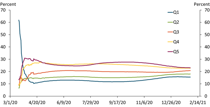
Sources: USAfacts.org, U.S. Census Bureau, Federal Reserve Bank of New York Consumer Credit Panel/Equifax Data, and authors’ calculations.
Importantly, Chart 2 shows that deaths across quintiles of financial distress have not converged to the same extent as cases. As of January 31, 2021, counties in Q5 accounted for about 23 percent (100,000) of all COVID-19 deaths in the United States, while Q1 accounted for about 15 percent (67,000). If deaths were evenly distributed across the United States regardless of financial distress, we would expect these shares to be closer to 20 percent. That said, the gap in deaths may narrow still, as deaths tend to lag cases.
A natural question is whether the difference in mortality across regions may be due to other variables that correlate with financial distress. For example, counties in higher financial distress also have higher incidences of tobacco usage and adult obesity. Although differences in these health metrics among high- and low-distress areas are significant, they are not large enough to explain the differences in COVID-19-related deaths we observe. Similarly, differences in access to health care do not fully explain the mortality differences, either._ Moreover, survey evidence suggests mask usage is actually a bit higher in areas of higher financial distress, so differences in preventative actions cannot explain the mortality differences._
Instead, our results may be indicative of the role that wealth plays in determining life expectancy in the United States (Reuell 2016). As shown in Athreya and others (2020), household income and wealth tend to fall as the incidence of financial distress rises. Thus, the differences in COVID-19 mortality we currently observe may persist, as they do for other causes of death.
Endnotes
-
1 We combine data from the Federal Reserve Bank of New York Consumer Credit Panel (FRBNY CCP) and publicly available, county-level data on COVID-19 cases and deaths. Our resulting data covers 98.4 percent of all COVID-19 cases and 98.0 percent of all COVID-19 deaths.
-
2 We measure access to health care by looking at the number of hospitals per 100,000 residents at the county level.
-
3 We combine our FRBNY CCP data with mask usage data from the New York Times and Dynata based on roughly 250,000 interviews conducted by Dynata from July 2 to July 14.
References
Athreya, Kartik, Ryan Mather, José Mustre-del-Río, and Juan M. Sánchez. 2020. “External LinkHousehold Financial Distress and the Burden of `Aggregate’ Shocks.” Federal Reserve Bank of Kansas City, Research Working Paper no. 20-13, September.
Athreya, Kartik, José Mustre-del-Río, and Juan M. Sánchez. 2019. “External LinkThe Persistence of Financial Distress.” Review of Financial Studies, vol. 32, no. 10, pp. 3851–3883.
Reuell, Peter. 2016. “External LinkFor Life Expectancy, Money Matters.” Harvard Gazette, April 11.
Kartik Athreya is executive vice president and director of research at the Federal Reserve Bank of Richmond. José Mustre-del-Río is a research and policy officer at the Federal Reserve Bank of Kansas City. Juan M. Sánchez is an assistant vice president at the Federal Reserve Bank of St. Louis. Olivia Wilkinson is a research associate at the Federal Reserve Bank of St. Louis. The views expressed are those of the authors and do not necessarily reflect the positions of the Federal Reserve Banks of Kansas City, Richmond, and St. Louis or the Federal Reserve System.
Author