Monetary policymakers pay attention to shelter prices for several reasons. Shelter represents around one-third of the basket of goods and services measured by the Consumer Price Index (CPI), a key measure of inflation. The housing market is also a key channel through which monetary policy affects the economy, as it is highly sensitive to changes in interest rates. For example, when the federal funds rate rises, other borrowing rates—such as mortgage rates—also tend to rise. As a result, consumers may find purchasing a new home less affordable, property owners may be less inclined to put their houses on the market, and building companies may limit construction plans. These outcomes in the non-rental market will have spillovers to the rental market: if purchasing a home becomes more expensive, or if the housing supply is constrained, many people will choose to rent rather than purchase living and working spaces.
To make effective policy decisions, policymakers need timely, accurate, and reliable data on rental prices. In the CPI, the measurement of shelter prices relies heavily on rental data, as shelter is defined not only by the price of renter-occupied housing but also by implicit rent that owner-occupants would have to pay if they were renting their homes (without furnishings or utilities)._ The U.S. Bureau of Labor Statistics (BLS) has historically been the “official” supplier of rental data and is used in calculating the CPI. In recent years, however, new rental datasets have become available, including a rental price index from the online real estate marketplace Zillow.
Data collected by Zillow differ in many respects from the BLS rental data, making both datasets potentially useful in different policy contexts._ For example, Zillow data are more comprehensive and geographically granular than BLS data. Moreover, the Zillow index only considers new tenants, whereas the BLS rent measure includes all tenants, with only around 20 percent of its weight on new rental leases. This focus on new renters makes the Zillow series a timelier snapshot of current renting dynamics but also more volatile and cyclical, as it captures short-run movements that do not show up in the BLS measure.
Chart 1 compares the levels of BLS and Zillow rental data as well as year-over-year growth. The left panel shows the levels of both rent measures indexed to 2011 (consistent with the availability of the Zillow data). The Zillow level index (green line) is systematically higher and more volatile than the BLS measure (blue line). The Zillow index is also more procyclical—declining after a recession—and tends to be less persistent or sticky than the BLS measure, as the BLS takes longer to reach its trough after the recession. The right panel shows the equivalent year-over-year inflation rates of both series. Although the two rent inflation measures mostly co-moved prior to the pandemic, the co-movement weakened markedly afterward as the Zillow series became more volatile. This dynamic likely reflects that at the onset of the pandemic recession, many renters either sought newer, cheaper rental contracts in their existing locations or moved away from high-cost metropolitan areas toward areas where they could more easily afford home office space. As the economy began to recover, these same factors largely unwound, and with housing supply still trailing demand, new rents started to rise. Over time, these new-rent-specific dynamics begin to appear in the BLS series: the earlier peaks and troughs in the Zillow data since the pandemic suggest that the Zillow series leads the BLS series by around six months.
Chart 1: Zillow rent index is more volatile and more procyclical compared with BLS rental index
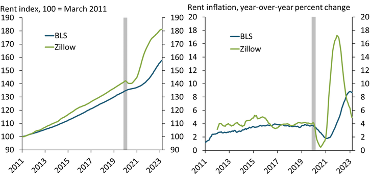
Note: Gray shaded area indicates National Bureau of Economic Research (NBER)-defined recession.
Sources: BLS, Zillow (Haver Analytics), and NBER.
To understand how these two rental price measures react to monetary policy, I model the effect of an unexpected monetary policy tightening over a 48-month horizon using monthly GDP, investment, capacity utilization, and different and separate price level variables. I perform the same experiment with the CPI (which provides an overall benchmark for the policy shock), the BLS measure of rental prices, and the Zillow measure._ Given data constraints, I use a proxy for the Zillow rental series following Bundick, Smith, and Van der Meer (2023), constructed to have similar dynamic features to the original Zillow data._
Chart 2 plots how the CPI, the BLS series, and the Zillow series react to the temporary monetary policy shock. The CPI (black line) drops immediately following the monetary tightening. However, the two rental series are essentially unchanged in the very short run, reflecting the inertia of housing markets and the slow resetting of rents. The Zillow price series (green line) starts to fall ahead of the BLS (blue line) and reaches its trough at around 35 months—somewhat later than the CPI series (at 30 months) but earlier than the BLS series (at least 45 months). This dynamic pattern echoes the analysis of the historical data patterns and highlights the Zillow index may provide an earlier signal of rental price dynamics than the BLS series.
Chart 2: Zillow index responds to monetary policy tightening ahead of BLS
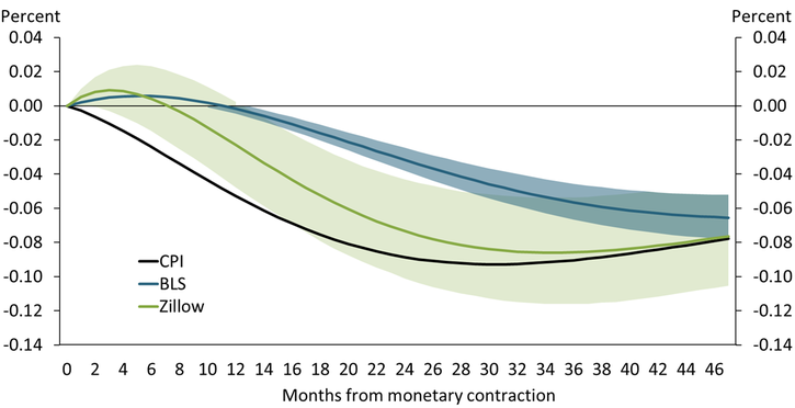
Note: The green and blue shaded areas show 68 percent confidence intervals for the Zillow and BLS series, respectively.
Source: BLS, Zillow (Haver Analytics), and author’s calculations.
In this model economy, if the monetary policy tightening is the only shock, then eventually all price series will return to a baseline of zero. However, the BLS rental series will take longer to return to its baseline than the Zillow series, as BLS data also contain existing rents, which shift more slowly than newly contracted rents. Indeed, as long as there is a gap between both rental series, then changes in Zillow will eventually be reflected in the BLS measure and, in turn, to the CPI.
Comparing both historical data and my model of the BLS and Zillow rental series offers a few key takeaways. First, although the BLS and Zillow rental series both provide information on developments in the rental sector, they represent different segments of the rental market with different associated information. The BLS series captures what is happening to the living standards of the typical household, while the Zillow series measures what is changing in the rental sector. Second, because the Zillow series measures new rental contracts, it tends to be more volatile, more procyclical, and less persistent than the BLS series and leads the BLS series by around six to 10 months. Finally, any gap between the BLS and Zillow series (for example, if the Zillow series increases more rapidly than the BLS series) suggests that tighter monetary conditions may be needed to bring CPI inflation closer to the Fed’s 2 percent target.
Endnotes
-
1 Owned housing units are treated in the CPI as capital (or investment) goods distinct from the shelter service they provide and therefore not as consumption goods. Spending to purchase and improve houses is also treated as investment and not consumption in the CPI. Finally, mortgage interest, property taxes, real estate fees, most maintenance, and all improvement costs are considered part of the cost of the capital good and therefore also not treated as consumption goods.
-
2 See also Adams and others (2022).
-
3 I use a vector auto regressive model (VAR). The monetary shock implemented follows Bundick and Smith (2020), who consider measures of forward guidance shocks at the zero lower bound in an estimated Bayesian VAR. Qualitatively, though, the results presented here would be robust to a standard implementation of monetary shocks.
-
4 They construct this proxy from the BLS measure of “rent of primary residence” by assuming that leases, on average, reset every 18 months.
References
Adams, Brian, Lara P. Loewenstein, Hugh Montag, and Randal J. Verbrugge. 2022. “External LinkDisentangling Rent Index Differences: Data, Methods, and Scope.” Federal Reserve Bank of Cleveland, working paper no. 22-38.
Bundick, Brent, and A. Lee Smith. 2020. “External LinkThe Dynamic Effects of Forward Guidance Shocks.” Review of Economics and Statistics, vol. 102, no. 5, pp. 946–965.
Bundick, Brent, A. Lee Smith, and Luca Van der Meer. 2023. “External LinkA Tight Labor Market Could Keep Rent Inflation Elevated.” Federal Reserve Bank of Kansas City, Economic Bulletin, March 1.
Peter McAdam is a senior research and policy advisor at the Federal Reserve Bank of Kansas City. The views expressed are those of the author and do not necessarily reflect the positions of the Federal Reserve Bank of Kansas City or the Federal Reserve System.